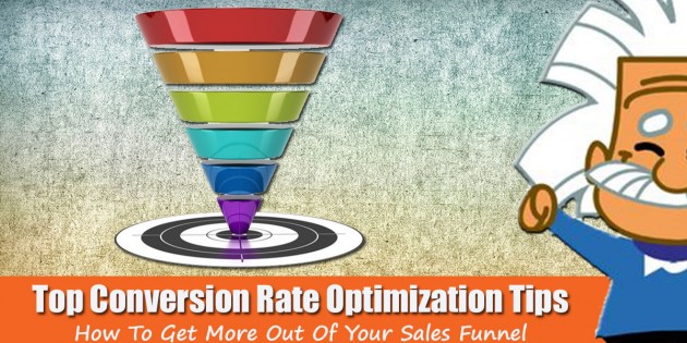
6 top conversion rate optimization strategies that will help turn your traffic into sales!
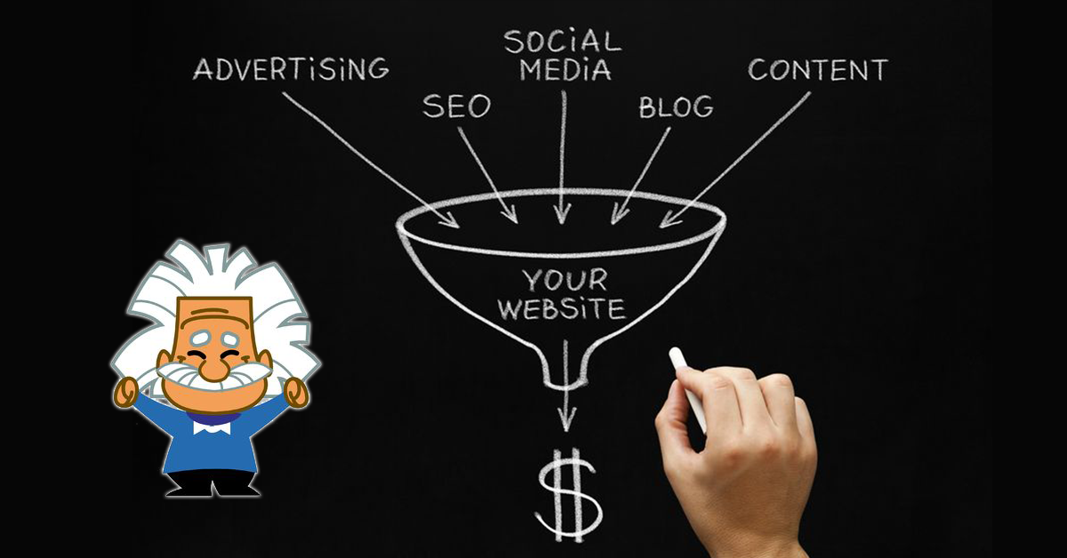
When starting out with pay per click strategies (specifically Facebook), many marketers focus solely on the ads portion. However, the complete success formula = Traffic * Conversion. Traffic is the people that you send to your landing page. Conversion is the percentage of people who take the action you desire. You really cannot have a successful marketing campaign without optimizing both sides of the equation.
While many of the posts on this blog revolve around Facebook traffic, and how to get high quality, low cost clicks from your target audience, it’s equally important to convert these individuals when they come to your landing page or website. Instead of just focusing exclusively on building traffic, spend a good portion of your time focusing on ways on how to improve converting it!
Here are some top conversion rate optimization tips that we have found useful in both our agency as well as in our digital products promotions.
1. Always be tracking. You can’t measure or quantify what you don’t track. The more data you have, the better decisions that you will make.
- Tracking codes– correctly placing the proper conversion tracking pixels in the headers of your different pages will provide you with valuable information. Don’t just stop on the opt in page. Place pixels throughout the sales process.
- Links– One mistake many marketers make is using 1 tracking link for multiple ads. Then they will make determinations based on Cost Per Click. While low cost clicks can be good, the ultimate goal is low cost conversions. Using multiple unique links will allow you to see the overall performance of a specific ad.
- Heat maps– heat maps will help you determine where people are looking most on your website, typically based off of the movements of their mouse. This info can help you see if the placement of your ads or call to action buttons are effective.
2. Always be testing. Always be willing to test what you think you know versus the alternative. Understand that you don’t really know what works best unless you’ve tested against alternatives. Here’s the biggest key to testing: giving the test enough time to allow you to collect enough substantial data to make a decision. According to Neil Patel, always run your tests for at least 7 days. Mondays aren’t Tuesdays – your Monday visitors may not be the same as your Tuesday or even Saturday visitors.
Here are some valuable conversion rate optimization test examples with which to start:
- The headline text (short or long headline)
- The call to action text
- The number of fields in a form
- Micro commitments (multiple steps to filling out info) versus one page with multiple fields
- The placement of the call to action (above the fold or below the fold)
- The size of the image
- The size or style of font
- Guarantees (30 vs 60 vs 90 days)
- The amount of content on the page
KEY TIP: When testing for conversion rate optimization, test one thing at a time. If you shorten the headline, change the color of the CTA button, increase the font size, and change the guarantee and see improvement in conversions, well, what was the cause? Create your hypothesis and then change one thing and track performance.
3. ‘Simple’ Landing Page Tips: Don’t assume that your target audience will easily navigate your sales page. A confused mind always says ‘no’ to an offer, so make it overly simple to maximize conversions.
- Ugly can be better. The prettier a website is, the more distracting it can be.
- Eliminate distractions, like Navigation Bars.
- Eliminate links that don’t serve a specific purpose from your landing pages. I’ve seen sites offer links to testimonials. Instead, place the testimonials on your page. You do NOT want people leaving your opt in page for another page. The only exception is a link to your privacy policy or terms & conditions.
- Consistency – make sure that the message on your lander is similar to your message in your ad. If you offer a 50% discount in your ad but your lander says ‘Buy One Get One Free’, even though it’s the same thing, you’re confusing your customer. They are looking for every reason to say no to your offer, and a confused mind will always say no.
- It’s not Me, it’s You: Take out every instance of “I” in your copy and rewrite it so that the emphasis is on “You”/”Your”. Example- Replace “Download A Free Copy Of My 100 Top Headlines eBook” with “Download Your Free Copy Of The Top 100 Headlines eBook“.
- Use real photos instead of stock images. Customers want a ‘real’ experience, and using stock images of people can make the experience seem fake.
4. Headline Tips: Your sales page headline has got to quickly capture the attention of the attention deficit disorder generation before they become distracted. Here are some tips on how to make this happen…
- Make it bigger. A bigger headline will attract more eyeballs.
- Make it shorter. If your headline is longer than 20 words, you’ll start to lose some people. A headline is meant to have instant impact.
- Make it easy to understand. A headline isn’t the place to be cute or clever. Blunt, plain, straightforward language is best. Make it clear enough for a four-year old to understand it.
- Use the R.O.T. formula: This is a great strategy from Neville Medhora. Results / Objections / Time: Write a headline that will give your target audience the results they want while addressing their top objection in a given time frame (ex: Learn How To Get That New Beach Body In Just 10 Days Even If You Don’t Have a Gym Membership).
5. Call To Action- A call to action (CTA) is vital to the success of your product. It is the instruction to the audience designed to provoke an immediate response. Here are some top tips about creating successful CTAs:
- Keep CTA buttons above the fold. A big mistake people make is thinking that their customers will scroll down the page. The button needs to be in a simple, easy to find place for your customer.
- Test specific words in CTA (free vs tria or our vs your). Don’t get too cute here. Keep it simple & direct. Avoid terms like ‘sound good’ or ‘interested?’.
- Colors (here’s an example of a red button out performing a green button)
- Buttons vs. open ended text to fill in (This trick improved conversion by 5% for the Obama Administration)
- The less information collected the better. Name and email will get you the best results. If you want more info, ask yourself if it’s worth lowering your conversion for.
- If you’re using long copy, add multiple calls-to-action throughout the copy. One above the fold, one at the end and others in logical places throughout the body text.
- Create an honest sense of urgency. You don’t want to be disingenuous with potential customers. One common mistake is offering an ebook or video series and saying that there is only 3 copies left. People don’t feel that you’re going to run out of an ebook. Instead, consider offering a bonus with the ebook and having a countdown on how long you’ll offer that bonus.
6. Consider Trust Elements- Your customer is always seeking validation when it comes to making a purchasing decision. Adding some of these useful tips below can be the difference between someone feeling comfortable enough with you to make a buying decision versus visiting a different site.
- Consider including third party trust seals such as Verisign, BBBOnline or Hackersafe to increase credibility.
- Have a Privacy Policy on your site. Believe it or not, people actually look at these as there is a good deal of paranoia about sharing info online.
- Put your refunds/return policy or guarantee below your checkout button instead of on a separate page or on a customer service page.
- Use Testimonials. Keep the testimonials on the page rather than posting a link. Use an actual image & quote from your target market. Also, use a testimonial on each page of your sales funnel.
- FAQs. Have FAQs on your page for the most frequently asked questions that your customers may ask.
- Add stats from surveys. If you survey your buyers, use those stats on the sales page. For example, “5 out of 6 moms recommended this product to their friends” is a powerful statement to have your potential customers see.
- Logos from Press Releases. If you’ve ever done a press release, then you’ve been on some credible sites. Through their tracking, find out what news sites your PR has been on and paste those logos on your site.
Remember, having sales success requires not only great traffic, but great conversion as well. By using some of these top conversion rate optimization tips, you can maximize your marketing dollars.
Have any questions or comments or suggestions regarding Top Conversion Rate Optimization? Leave them below!
Nick Bridges
Latest posts by Nick Bridges (see all)
- Facebook Releases 8 New Standard Events - November 14, 2018
- Facebook Pixel Changes 2018 - October 11, 2018
- Writing Compelling Ad Headlines that People Will Click - September 12, 2016