Since the average click-through rate of a banner ad is said to be 0.1%, many marketers avoid placing banner ads on the Google Display Network and stick to Facebook or AdWords instead. I’ve had marketers ask me this question over a hundred times:
“Do banner ads work?”
That question is best answered by this great infographic from Business 2 Community:

How to use banner ads
Banner ads do more than just drive traffic. Nowadays, businesses are using them less to drive traffic and more to increase brand awareness.
Matt Hardy ran an experiment to see if banner ads could increase brand awareness and have a positive impact on business. In his study, he revealed that blog mentions and forum entries went up by 110%, while brand awareness increased as more ad impressions were served.
Since banner ads receive few clicks and marketers are charged on a pay per click basis, they provide businesses with an extremely cheap yet highly effective way to increase branding.
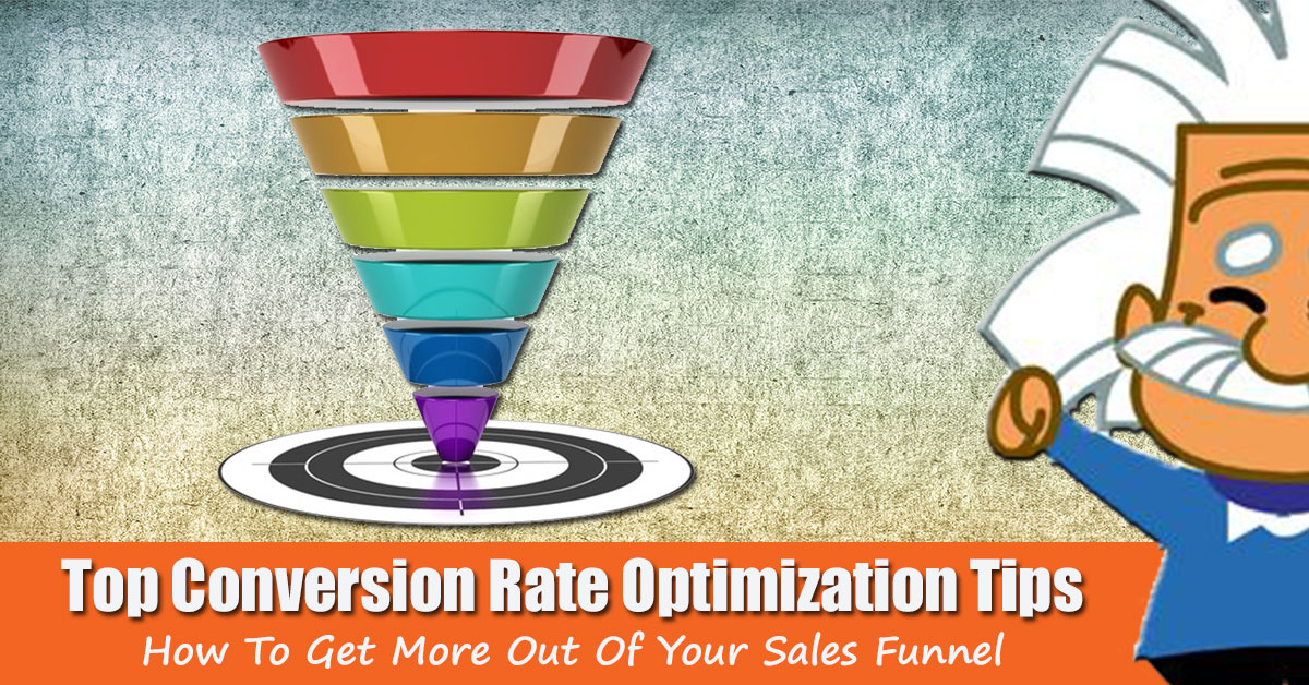
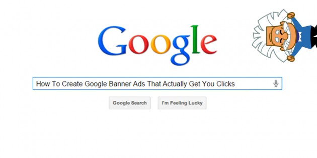
How to create Google banner ads that get clicks and increase brand awareness? Here’s 5 tips to get you started.
1. Understand the 3 fundamentals to high converting banner ads
If you’re looking to get more clicks and increase brand awareness at the same time, your banner needs to contain the following: company logo, value proposition and a relevant call-to-action:

Act On hit all 3 points with their banner ad. The upper part of their advert clearly displays their logo, the value proposition takes centre stage with the call-to-action at the bottom.
This banner creates brand awareness (logo is clearly seen), increases CTRs by giving prospects instant gratification of what they will receive (free guide), with a simple CTA to help them make the intended action (click).
Hooq follow the same fundamentals with their banner ad:

Both adverts clearly state who they are and the outcome of clicking the add.
2. Readable text
Prospects are going to spend less than a second looking at your banner ad, if they cannot read the font, text blends in with the background or the banner ad looks tacky – they will ignore it. When was the last time you saw a poorly designed advert and spent time reading or even clicked?
Ajarn Recruit used a poor choice of color for their font which blended in with a poorly chosen background, making the text hard to read, ugly and pixelated:

Their mistake was using too many colors which makes it hard for us to focus. Compare that advert to Grammarly’s Google Banner Ad, as well as following the standard fundamental structure, their font is clean, easy to read and uses a simple color scheme:

Grammarly used a different font size for the headline, body and CTA. The change in size segments the advert to create multiple ‘eye-contact’ points for their company logo, value proposition and call-to-action.
ROI.com.au do the same exact thing with their advert:

They have segmented each part of their advert by using different font sizes, text and color. Both adverts tell a story, and mixing up the size of fonts helps get prospects from start to finish.
3. Branding your advert
Remember, you’re not only using banner ads to generate traffic but to increase brand awareness. One way to increase awareness is to show your ad to the right people, but that alone isn’t going to be enough. Your banner ad needs to echo your brand values and become a representation of your website or store.
Here’s a Leadpages banner ad (notice they followed all the tips mentioned so far) using the exact same theme and color scheme as their website:


The key to branding is keeping a consistent message throughout all platforms. Imagine if Apple ran a banner ad and replaced their company logo with this:

Would you click? Nope, me neither.
4. Use images in context
So far only one banner ad (Act On) have used a picture to further enhance their message. Creating a great banner ad using creative typography can usually be just as effective, but if you choose to use images, make sure it fits in with branding or the value proposition.
Hootsuite offer an all-in-one social media package helping marketers win at social media. Their Google ad shows a person raising their hands (sign of winning) to further enhance their value proposition:

Anybody who manages a social media account knows that growing a following and receiving engagement is extremely difficult. The image plays on that knowledge and positions their product as a tool used by winners.
Who doesn’t want to be a winner?
5. Picking the right colors
Whenever you’re doing anything with images, color is going to be a huge factor. You can quickly scroll up this article and see that each advert (except for Ajarn Recruit) have used a specific color scheme.
This infographic by KISSmetrics is a great place to pick the appropriate colors for your next banner advert:

Summary
Google banner ads may not receive as many clicks as other PPC methods, but they definitely have their place in PPC marketing, otherwise nobody would be using them. PPC primarily focuses on driving traffic to a website (hence the name), but it’s also been proven to reach other goals such as branding at a much cheaper cost.
What do you think about banner ads in 2015, are you using them?
Nick Bridges
Latest posts by Nick Bridges (see all)
- Facebook Releases 8 New Standard Events - November 14, 2018
- Facebook Pixel Changes 2018 - October 11, 2018
- Writing Compelling Ad Headlines that People Will Click - September 12, 2016